Wednesday, 28 March 2012

Adriana Curcio's 7 Top Tips For Fashion Photography

As I have decided that I want my music magazine to have a big influence of fashion within it, I decided that I should look into what makes a good fashion photo. When looking into this I found that professional fashion photographer Adriana Curcio has released her 7 top tips on how to do this. Below is an example of the outcome of Adriana's photos.


Adriana's seven top tips are:

  1.  Preparation- The most important thing you can do before a photoshoot is over prepare so that you know exactly what you want your outcome to look like before you start shooting.
  2. It's your concept- The idea needs to be yours and you need to control it, if what you produce isn't your vision then that will come across in the images.
  3. Move- You need to experiment from every angle when shooting this will help you to find your perfect shot.
  4. Be a director- Give the model direction, inspire them with your vision.
  5. Break the rules- Not everything needs to be lit perfectly or be completely flattering. Something can be found in high contrast and dramatic lighting. Bend and break the rules as you might be surprised with the outcome.
  6. Never stop shooting- Shoot as much as you can, the moment you start to stop is when you lose your creative energy and start to second guess yourself.
  7. Confidence- You have to believe in yourself and your work, the best way to learn is by completely throwing yourself into it.


Where My Magazine Would Fit In The Institution

From looking into the magazines that big companies such as IPC Media produce, I think that my magazine is more likely to be produced by an independent company. I think this because my magazine is going to fit the genre of Indie so it isn't going to be like the generic magazines that are out there because it will have a more unique feel to it. As more unique magazines I have looked at such as i-D and Wonderland all have independent produces it would fit my magazine more to have an independent producer too. Especially as the larger companies that produce a wide variety of magazines produce magazines in a way that isn't anything new and is very generic. As this is the case I wouldn't want my magazine to look like any other boring magazine that is already out there so therefore I wouldn't want it to be produced by a major company.


As well as the fact that I wouldn't want it produced by a major company I also think that because my magazine is going to be just starting up with no big name or much money behind it. The major firms wouldn't have much of an interest in it because of it being so unique it would end up being a risk for them that they wouldn't want to take. While an independent company would be more likely to actually put money into you because they already work with magazines like that so they would be able to figure out whether the magazine would work or not. Therefore I think an independent company would be more beneficial for my magazine.

Friday, 23 March 2012

Prezi


<object id="prezi_f84c850d0b5fd5ab14bba350f657b415c4225628" name="prezi_f84c850d0b5fd5ab14bba350f657b415c4225628" classid="clsid:D27CDB6E-AE6D-11cf-96B8-444553540000" width="550" height="400"><param name="movie" value="http://prezi.com/bin/preziloader.swf"/><param name="allowfullscreen" value="true"/><param name="allowscriptaccess" value="always"/><param name="bgcolor" value="#ffffff"/><param name="flashvars" value="prezi_id=f84c850d0b5fd5ab14bba350f657b415c4225628&amp;lock_to_path=0&amp;color=ffffff&amp;autoplay=no&amp;autohide_ctrls=0"/><embed id="preziEmbed_f84c850d0b5fd5ab14bba350f657b415c4225628" name="preziEmbed_f84c850d0b5fd5ab14bba350f657b415c4225628" src="http://prezi.com/bin/preziloader.swf" type="application/x-shockwave-flash" allowfullscreen="true" allowscriptaccess="always" width="550" height="400" bgcolor="#ffffff" flashvars="prezi_id=f84c850d0b5fd5ab14bba350f657b415c4225628&amp;lock_to_path=0&amp;color=ffffff&amp;autoplay=no&amp;autohide_ctrls=0"></embed></object>


This link above shows my prezi which shows research into the four major firms in the magazine industry, these firms are Bauer, IPC Media, Conde Nast and Hearst. In this research task we were finding out all the primary information behind these companies such as what magazines they produce, how successful these magazines are and any other relevant information to the study of the magazine institution. My role in this prezi was finding out information about IPC Media.


The main information I found out about IPC Media is that they are a UK based company that are split into five sections which are IPC advertising, IPC connect, IPC inspire, Marketforce, and IPC Southbank. This original information shows that they are a big enough company to split into different sections so that each part of the company has a focus. IPC Media owns magazines such as Nuts, NME, Marie Claire, Look and Now. These are some of the big generic magazines in the UK showing that this company has some major industry power. As well as these well known magazines it also owns 60 iconic brands showing that the power this company has in the UK is quite big. Although they have this major power in 2011 they shed 14.2% of their circulation year on year because of the declined sales of music magazines NME and Uncut. This shows that although they have big power in the industry they are also starting to lose this power through generic style of their magazines. As I looked at in my previous post individual magazines from individual publishers are becoming more popular so company’s like IPC Media are slowly going to start losing their big revenue unless they change to fit the new magazine institution.


As well as having declined sales on certain magazines within IPC Media there is also surrounding controversy on some of their magazines. Such as when Morrissey won a pre-trial hearing against Conor McNicholas (former editor of NME) and IPC Media which he have his day in court later this year to ‘clear his name’ against racism accusations. This is something that may stir away potential readers if they don’t agree with a controversy surrounding a magazine within this company as this will assist the declining sales. This also gives the magazines and the company’s a bad name because they don’t trust the information that they are selling. Although there is this surrounding them they do still get over 20 million users every month on their website showing that although they have declined sales they are still popular with quite a lot of people.


From the information displayed in this blog we can clearly see that these major firms do still have power as the magazines they own are still popular. Although this institution is constantly changing so unless the rise of individual magazines stops then these firms are still in danger of losing their audience. But as long as they keep the major magazines that they own fresh and interesting for their readers then their position at the top may be safe.


Magazine Institutions


‘The magazine industry represents a hybrid structure. The top tier has an oligopolistic structure, with four firms controlling the majority of revenues in the industry. The remaining lower tier, however, resembles a monopolistic competitive market structure. Remember that in this type of structure, there are many sellers offering products that are similar but are not perfect substitutes for one another. Numerous publishing companies vie for a share at this end of the market. The large number of individual publishers suggests that there will be several titles geared toward specific interests, yet each is somewhat unique in its presentation. Overall, the prices paid for magazines indicate more of a monopolistic competitive structure. If the entire magazine industry operated as an oligopoly prices would be similar across the industry.’ Alan B. Albarran


From this quote you can gather that it explains the top of the structure therefore the higher more successful end of the industry is controlled by the four main firms which are Bauer, IPC Media, Hearst and Conde Nast. These firms make magazines such as Kerrang, Q, NME, Now, Cosmopolitan, Elle, Vogue and Vanity Fair. Although these magazines that they make are still very popular there are other magazines made by individual firms that are becoming just at popular. This shows that with the growth of technology you don’t need to have a multimillion company to be able to make a magazine that the people will like. Therefore this starts to go against this quote with these four main firms not controlling the main revenue anymore and the individual companies starting to make a good name for themselves.


One of the magazines that I analyzed was Q magazine which is produced by the major firm Bauer this magazine goes against the idea that these mainstream magazines are old now and aren’t moving with times. As Q started out in as a magazine in 1986 but has moved with newer technologies to form a radio station in 2008 and a television channel. Although they moved with these new advances in technology they have yet to release an ipad app which is the new movement in magazine production. A magazine that has made a big change for the magazine industry in this way is K Composite as it is now exclusively a magazine for ipads but it is also free. This shows the direction that the magazine industry is heading in and whether this might be the end for print magazines. This new access to magazines on apps makes it a lot easier for people to get them and gives them a completely new experience as viewing them in this way is so much different. There is also the added bonus that K Composite is free meaning people can read the magazine they like without having to pay the price this shows it is possible to create a good magazine without needing to put a big price tag on it. The more apps that come out like this the more likely they are to change the way the magazine industry is because people aren’t going to pay for expensive print magazines when they can get just as good quality magazines on an app for free. This shows the way that major magazines need to move in order to keep the mass audience that they have aquired.


Another one of the magazines that I analyzed was Spin magazine which is published by Spin Media LLC this shows an independent company that isn’t part of the four main firms. Yet even though it isn’t part of one of these firms it is still widely popular. Spin magazine is a primary example that breaks the idea of these four firms controlling the magazine industry and it also paths the way for new digital technologies. With Spin magazine first going online in 2008 with a digital edition made through Texterity. It has now had a relaunch in February 2012 with the magazine going into a larger, bi-monthly format with reviews being seen on the website on Twitter rather than in the magazine which now does longer and extended editorials and interviews mainly on up and coming talent. This shows that Spin magazine has gone down a different route with the digital age as it has not yet made an ipad app but has instead decided to go with the craze of social networking therefore gaining a wider audience as it makes it easily accessible to the consumers as Twitter is something that the majority of users have on their smart phones. This makes it something you can read on the go and again because it has been made online it is also free which links again to this idea that the technology is so easily for even amatuers to use and without it being expensive there is no longer the need for magazines to cost a lot of money as they no longer represent skills that only the trained can do.


A magazine that I decided to look into was i-D magazine which is again an independent publisher which is Levelprint Ltd that started out as a fanzine with the text produced on a typewriter although now it is a mature glossy magazine although it does still keep this street style to each issue. This shows the idea that these individual magazines are becoming more in the limelight because they are much more interesting than the generic style magazine that everyone has read about a million times. i-D is a prime example of breaking away from generic magazines as it has the quirky idea behind it of its masthead being a winking face side on and then with most covers of i-D featuring the model winking. This really gives the magazine it’s original stance and is something that makes it so interesting. Another magazine that shows an original stance is Wonderland which was founded by Peter Jones on Dragon’s Den this shows the power again of technology as this magazine was found through a very popular TV show. This again is an independent magazine with an independent publisher that also introduces new technologies with a Wonderland Blog meaning people can access news through an easily accessible way.


From looking at all of these different magazines and there different publishers I think it is apparent that times have very much changed from when the quote at the top was stated as no longer to those four major firms control the magazine industry as in fact they are more responsible for magazines that are generic and don’t break any boundaries. The real change in the magazine industry is that these individual publishers are bringing out magazines that are far more interesting and exciting then anything out there meaning they are going to get a whole new audience that are bored of the current magazine industry. A big part of this is going to be the ever changing technology advances and the magazine industry is most likely going to change a lot of because of them. But these changes are something that can bring magazines more alive for readers and give a whole new experience that they have been waiting for.


Studio Lighting

To create a good photo you need to ensure that the lighting is correct so that the result is best that it can be. To make sure that when I take the photos for my magazine they are the best that they can be I have looked into studio lighting techniques so that I know what I need for my shoots.

Key Light- This is the main powerful light source that creates shadows with a direct or soft light. The direct light is created through a reflector with barn doors or the soft light is created through a diffuser such as an umbrella.

Fill-in Light- This is an additional light source with diffusers, soft boxes etc. In this situation barn doors can be used to stop reflections in the places that you need to be in the dark.

The order to set flashes up- First you need to set up the background light and the hair light this will allow you to see what light sources these create. Next you set up the fill light and then the key light must be last. It is important to check what each light produces before you set up the next one so then you know which flashes to turn off and which ones to keep on.


There are several types of lighting that you can use to get different effects on a models face such as broad lighting and short lighting which includes frontal, side, back and 3/4 lighting. 

The different broad lighting includes: 

Frontal Lighting- Full lighting of the face side that is turned to the camera. 


Three Quarter Lighting- The light source is set up close next to the camera so that the light is turned to the camera side of the face. The shadow is then minimised because it is appearing on the narrow side of the face. 


The different short lighting includes: 

Three Quarter Lighting- The key light is set up to illuminate the side of the face turned aside from the camera. Minimising of the illuminated side of the face visually narrows the face. 


Side Light- Partial illumination of the face side turned to the camera. A short light makes it more dramatic as it has more shadow on the face and can also make the face look slightly thinner. 


Friday, 9 March 2012

David Bailey Photography

David Bailey is an English photographer who started his career in 1960 as a photographer for john Cole's Studio Five before being contracted as a fashion photographer for Vogue later that year. In this year he went on to capture and help develop the Swinging London of the 1960's a culture of high fashion and celebrity chic. In his career his has photographer Alice Cooper, The Beatles, Mick Jagger, and many more as well as going to Afghanistan in 2010 to photographer British troops for the charity Help For Heroes.


This particular photo really caught my eye because of how completely flawless it looks especially in black and white. I think this really shows the fashion photography side to David Bailey as this image gives a strong outline of the model's features making her stand clear against the black background. As well as this the pose she is pulling makes her look very feminine especially with the simple fashion details of a black dress and diamond bracelet. This gives the old fashion element of what would have been in fashion at the time. This is something I really wanted to look at as for my photos to really get the fashion element in them I need to look at original fashion photography from the early days to get these key features.

This photo interested me because there is the clear fashion statement of what the model is wearing as this outfit is very 1950's/1960's. Apart from the interesting appeal of the fashion there is also the fact that the model is wearing clothes that stand out but yet the model herself looks shy and almost vunerable. This creates a very different image above which shows that fashion photography doesn't always need to have an in your face model pulling an outrageous pose it can in some cases be a lot more subtle.


Rankin Photography

Rankin is a British portrait and fashion photographer, he started his career with the magazine 'Dazed and Confused' which he founded with Jefferson Hack. Rankin then went on to lauch his own quarterly fashion magazine in December 2000 called 'RANK'. As well as this he publishes 'Another Magazine' and more recently 'HUNGER'. In his various work he has photographed many famous people including Britney Spears, Kate Moss, Vivienne Westwood, Lily Allen, Madonna, The Rolling Stones, Tony Blair, Queen Elizabeth II, and many more.


I really like this photo as it's a clear fashion shot which is the kind of photography I am interested in looking at for my magazine. The positioning of this photo works really well with the model posing straight at the camera in a way that makes her body look slightly obscure but still has that sex appeal that you would expect to be there. This links in with Laura Mulvey's theory of the male gaze as this is clearly going to be pleasing for the male audience member. Especially with the aspect of her hair blowing around slightly giving this slight wild side to the model making it seem more intriguing for a male. Another aspect that is clearly to get the audience interested is the star vehicle as it is Mary-Kate Olsen that is photographed here so as she is widely known if this was put on the front cover of a magazine then it is likely to sell. 


I like this photo for the same reason as above because it is a clear fashion shot with this one being more apparent as it is showing what the model is wearing more than the first one as well as her pose is showing her off more therefore trying to get the audience to look at it. The positioning of this photo again works well with background getting lighter the closer it is to her making it frame the model nicely. As well as her pose standing clear against the background and the model's long hair creating a contrast against the sharp shapes of her clothing and pose. As the wild hair adds colour and an almost exciting part to the image making it stand out. This photo again links in with Mulvey's theory of the male gaze as the model is clearly posing in a way to please the male audience because she is pushing her body out further and making this the main attraction. Again star vehicle is used here with the model being Lindsey Lohan who is again very well known meaning she can sell a magazine easily. 

From looking at both of these images you can tell that Rankin focuses on fashion shots that are very different from each yet still very effective but he likes the model to remain a sex appeal for the audience member and this is a clear running theme throughout his work. 


Andy Fallon Photography


To gain a better understanding of the genre of Music photography I decided to look at the work of a number of leading photographers who work for NME, MOJO, Q, Kerrang, Metal Hammer and Uncut. Specifically I looked at the work of Andy Fallon. The work of Andy Fallon interested me because his photos ensure that the essence of the subject is captured and therefore make them more striking and eye catching. His unique and intimate portrait style has won him a solid reputation as a music photographer especially after he has shot iconic images for the likes of Morrissey, Michael Stipe, The Killers, Dave Grohl, Dizzee Rascal and more. Not only has he taken portraits of such high status artists but he has also had portraits published in The Guardian, The Saturday Telegraph, The Sunday Times, NME, MOJO, SPIN, and Rolling Stone.


I found this photograph really eye catching because of the bright colours and also the bold styling that is used here. I think this is done as a way to catch the audience’s attention because if this style of photo was used for a magazine front cover than people are more likely to look at it because of these colours and are then more likely to buy it. I think in the terms of Andy Fallon’s individual photography style he is trying to capture the essence of the artist that people wouldn’t expect to be, as if showing the audience something new to them. It also has the reference to Andy Warhol pop art creating a style surrounding it that is familiar yet different in this specific content. I think the representation of the female in the picture links to Laura Mulvey’s theory of the male gaze which states that women are only there as an object of desire and this is done through three different ways; the look of the audience, the look of the camera, and the look of the male spectators. As although she isn’t pulling an obviously sexual pose it is still clear that she isn’t wearing much and that she has a lot of bare skin on show. This links back to Mulvey’s theory as the idea that she doesn’t have much clothing on shows she is an object of desire because men are picturing her body more because she is showing so much skin. Also the pose that she is pulling is showing a secretive stance but with her pursed lips it is almost as if she is flirting with the audience. As this pose has lustful connotations of what the secret could be and this links back to the male spectators as this is something that will appear to them. There is also the use of star vehicle in this photo which appeals to the use for a magazine front cover as it will attract fans of that artist. Although the artist being used is Beth Jeans Houghton who isn’t as widely known as many artists so the fan following for her would be a much smaller niche group.


I think this photo is really interesting as it shows a good use of location while the old sofa is showing something that you would not expect to be here. I think this type of bold photography works well because it gives the audience member a variety of different focuses inside the photo as the location has an attraction because of the countryside element. I also think by having the star vehicle of Carl Barot the indie rock musician in this photo this setting is perfect as it shows the contrast between his rocker image with the green vast countryside. This works well because the connotations of his rocker image and the relaxed pose on the sofa are he is laid back, careless, and sticking to the conventions of what a rocker does. But the contrast with the background shows a setting far from the fast paced rock musician lifestyle creating an overall image that captures the audience in. This image also sticks to the stereotype that men are lazy and shouldn’t have to do much as this shows him just lounging about without nothing else to do.


Feature Article Flat Plans


This is my plan for my feature article I think this layout will work well because it gives a good balance between the text and the images. This means that it won't look overpowering with text and will get my images in there to add interest to the article. 

Contents Page Flat Plans


These are my first plans for my contents page. I think that the bottom plan looks too busy and won't work well as a contents page. I think the top plan looks the best out of the two and is most likely to work the best so therefore I will follow this plan. 


Front Cover Flat Plans


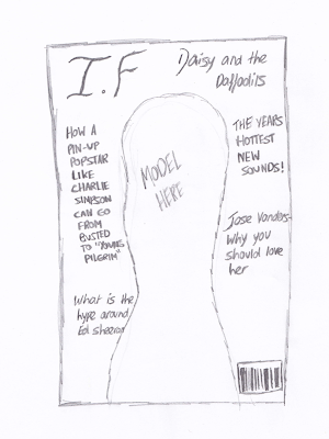
These are my two original front cover ideas. I like elements from both of them although this is just a rough draft of what they could look like. I plan to play around with both ideas and decide which one looks the best out of the two. 


Audience Profiling


The target audience for my Indie music magazine has very specific elements to the things that they like. As the genre of Indie is very specific with the styling and music always having to be individual as is obvious by the title and as something that stands out as a way to show this individuality and creativeness. For my specific magazine my target audience is mainly going to be girls at the age of about 16-24 as I want my magazine to have a high impact on the fashion side within the music. So this side is more highly based around girls as they keep up with the indie fashion by wearing clothes that a lot of people wouldn’t dare to. From this I think my target audience member would be the kind of girl that shops at high street fashion retailers but only the big ones such as Topshop being the main one here. As Topshop is one of the foremost shops for up to date fashion that is far from mainstream.


Along side this high street fashion retailers I think my target audience member would be the kind of person to also go into charity shops to pick up second hand clothing items that have a slight edge to them. This is also effective for their individual look as by buying clothing from charity shops it is unlikely that other people will have the same thing. From looking at the kind of clothing I think my target audience member would wear I think that this needs to be reflected on my cover model in order to get the target audience member interested in my magazine. As this will make them feel like this magazine is directed straight to them and is about the things they are interested in.
Another thing that can be connoted from how the target audience member dresses is that they have a very confident and outgoing personality. So I think this needs to be reflected within my magazine by choosing stories that they can actively be interested in. Such as interviews that they can read and respond to or a track list of artists that they can go away and listen to. I think using these kind of stories that can bring out their personality or by showing a famous artist having this same style and personality makes it much more personal and that my magazine is something they need in their life as it fits perfectly.

From this kind of fashion scene that my target audience member is into their music interests will also link in to this. With them being interested in music that is individual to mainstream pop so maybe having more meaning and a more garage band sound. This means that for my magazine I should include a lot of music from unknown or up and coming musicians as this is the type of music that links in with being individual and having that more unique sound. This idea of unknown musicians also links in with my target audience members image as it shows they have a more unique and further developed taste.


Another feature that needs to be added into my magazine is certain aspects that appear in my target audience members magazines that they already read. As these are something that is a part of their current lifestyle and I want my magazine to fit in with this lifestyle perfectly. I think my target audience member would read normal magazines such as cosmopolitan to look at current fashions and to discover how they can make them more individual. As for music magazines I think they would read Q, NME and Kerrang as these are some of the most popular music magazines that appeal to a wide range of tastes. I also think that certain members of my target audience would look at magazines such as ID and Dazed and Confused as these are much more unique and individual and show things in a much different stance to other magazines.


I think that my target audience member would fit into the demographic of band C1 down to E because the majority of my audience are likely to be students so they won't be earning much to be in those higher boundaries. 

Survey Monkey


I created a survey monkey that involved questions that would help me to narrow down my target audience so I can pinpoint the lifestyle that they lead and tailor my music magazine to fit this. I needed the questions to help me find out their age, gender, what they do, and the types of stories they are interested in finding within my magazine. This information can go towards making sure that my magazine appeals directly to them so that it is something they must read. I want to present my magazine in a way that fits straight in with their lifestyle and is personal to the members of my target audience. For this my survey monkey was very helpful as it created an outline of my target audience to make it clearer to me of what they would like to find.


From the screenshot above it is clear that my primary age group is going to be from the ages of 17-18 as this has proven to be the most popular. Although as this is a quite narrowed down age group my broader range would be to the ages of 16-22 as these have proven to also be popular. This more broad age group gives me a better target audience to aim too as there are more people involved within this age group.


This screenshot here shows the question of what do you do for a living and from this I found that the majority of people are students. This gives me more of an idea of the kind of things to put in my magazine knowing that my target audience is mainly made up of students because it means they like going out a lot and I can keep them informed of gigs close to them. Also because of the fact that my target audience is made up of students I need to ensure that I keep my magazine at a reasonable price so that my target audience can afford it.


This screenshot shows me what music magazines my target audience already reads so that I can include aspects of these but make them slightly different with new ideas within mine. These results show me that my target audience's current most popular magazines are Q and Kerrang so this means I can involve features of these magazines within mine to make it familiar to my target audience while still having a fresh stance against magazines already out there. 


This question is asking my target audience whether they would prefer the cover model to be male, female or both as this information will help me to decide who I put on my cover. From these results I can see that my target audience would prefer a female cover model which means I can use a female cover model to suit what my target audience would rather see. 


From this screenshot you can see I was finding out from my target audience which masthead they would prefer, I found four possible mastheads for my magazine then used them to show my target audience to find out which one would best suit their needs. From the results it is clear that masthead 1 was the most popular so therefore this is the one that I will use on my final magazine cover. 


In this question I was finding out from my target audience which colour scheme they would prefer so that I know which one to use for my magazine front cover and throughout my magazine so that is reflects the target audience's needs and looks appealing to them. The results showed me that the colour scheme that is most popular with my target audience is white, black, blue and yellow. 


In this screenshot I was finding out from my target audience what type of feature articles would most interest them when reading a music magazine. As this was an open question I had a variety of responses but the most popular ones included popular artists/bands, break up stories and live show reviews. From this information I can include these types of feature articles within my magazine so that my target audience can find stories that interest them which means they will want to read it. 


This question was to find out what stories my target audience would like to see on the front cover of my magazine to get them interested in reading it. The most popular responses from this were stories about new album releases, new artists and band gossip/splits. From these results I can include these on my cover to get the target audience wanting to read my magazine because it has the stories they are interested in reading.