I liked this image because it shows the idea of five students that represent my target audience, also the different colours show a different and interesting aspect to attract the readers attention. Although the photo isn't fully focused and is slightly blurry so I don't think this would work well as my front cover because it won't look very professional. Also it would be quite hard to work with as it has five students there isn't much spare background space to fit writing in, and the writing would look too busy overlayed on the image.
I like this photo because it sticks to the convention of a close-up shot for the front cover and I think it looks better than the one above because it doesn't look as blurry as it is in better focus. I also think this would work well at appealing to my target audience as the image could be used easily for referring to a story about art or photography which proved to be popular with my target audience.
This photo also shows the common convention of a medium shot for the front cover but it again is out of focus and is slightly blurry which makes it look less professional. I think if I used this photo the target audience would be put off by the fact the cover photo is blurry because it makes it look as if there hasn't been a lot of effort put into making it. Also this is something I pointed out on the Bodmin College magazine cover that the photos used were blurry and it didn't look good so this is something I will ensure I avoid on my cover.
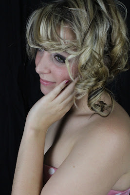
I think this photo is the best one out of these because it looks like how I wanted it to in my flat plan design, and it also represents the common convention of a medium shot which is something I wanted to include within my front cover. I also think it would work well as my front cover because there is clear space around the model in the image where I can place the writing without it looking too busy. I think combining this image with the writing fitting around it would look the most professional and look best for a college magazine.


Proficient/excellent organisation of models, costumes and locations.
ReplyDelete